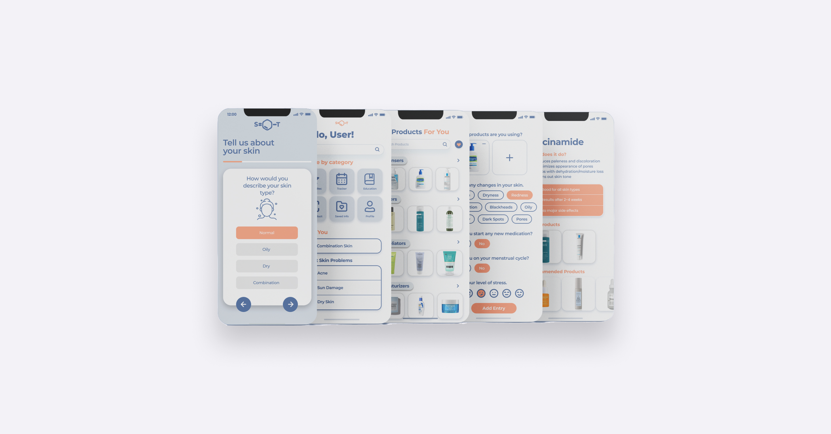
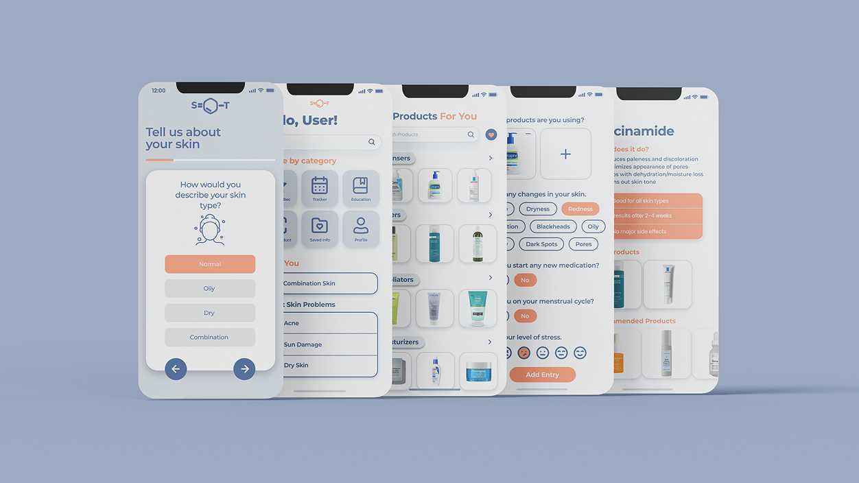
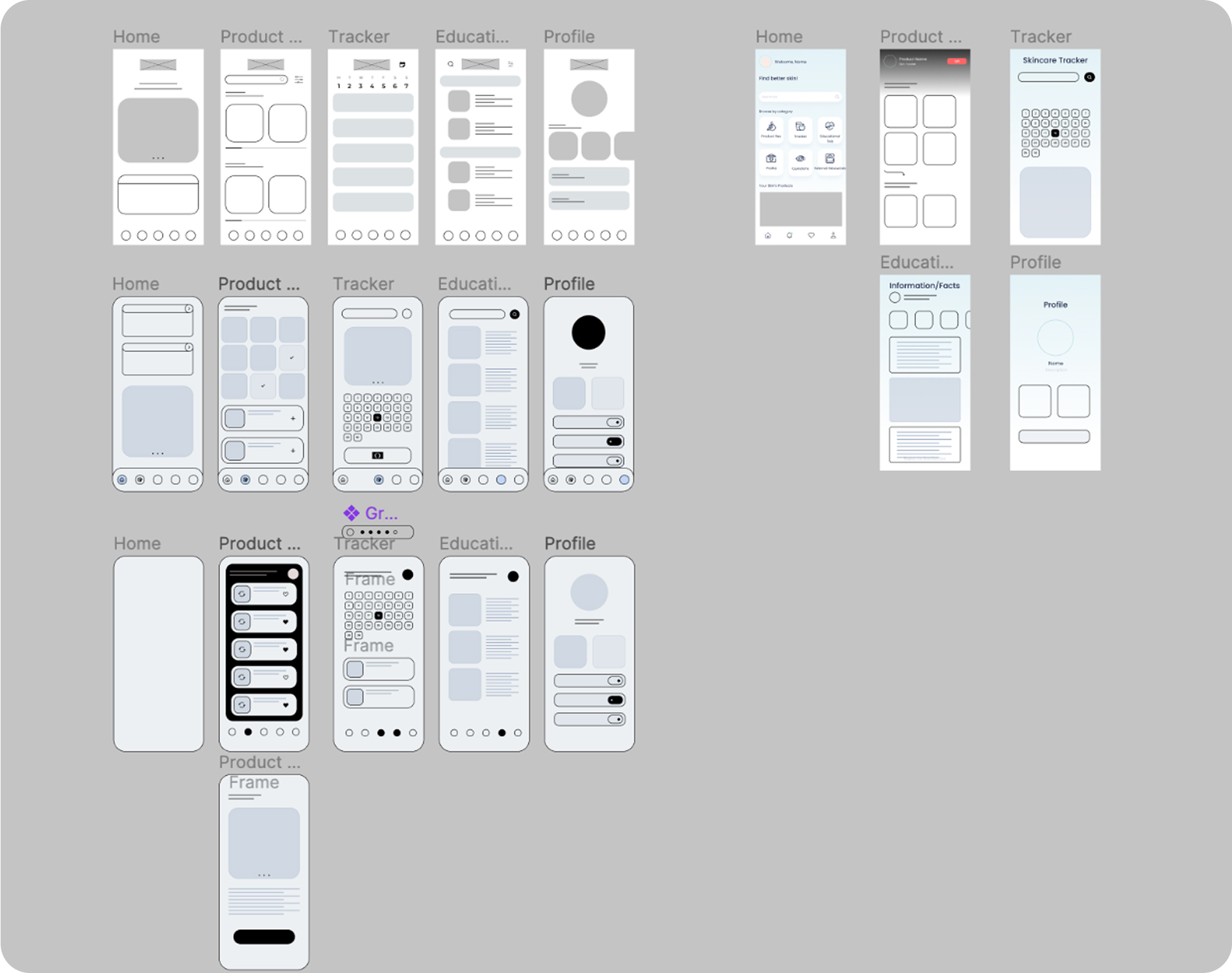
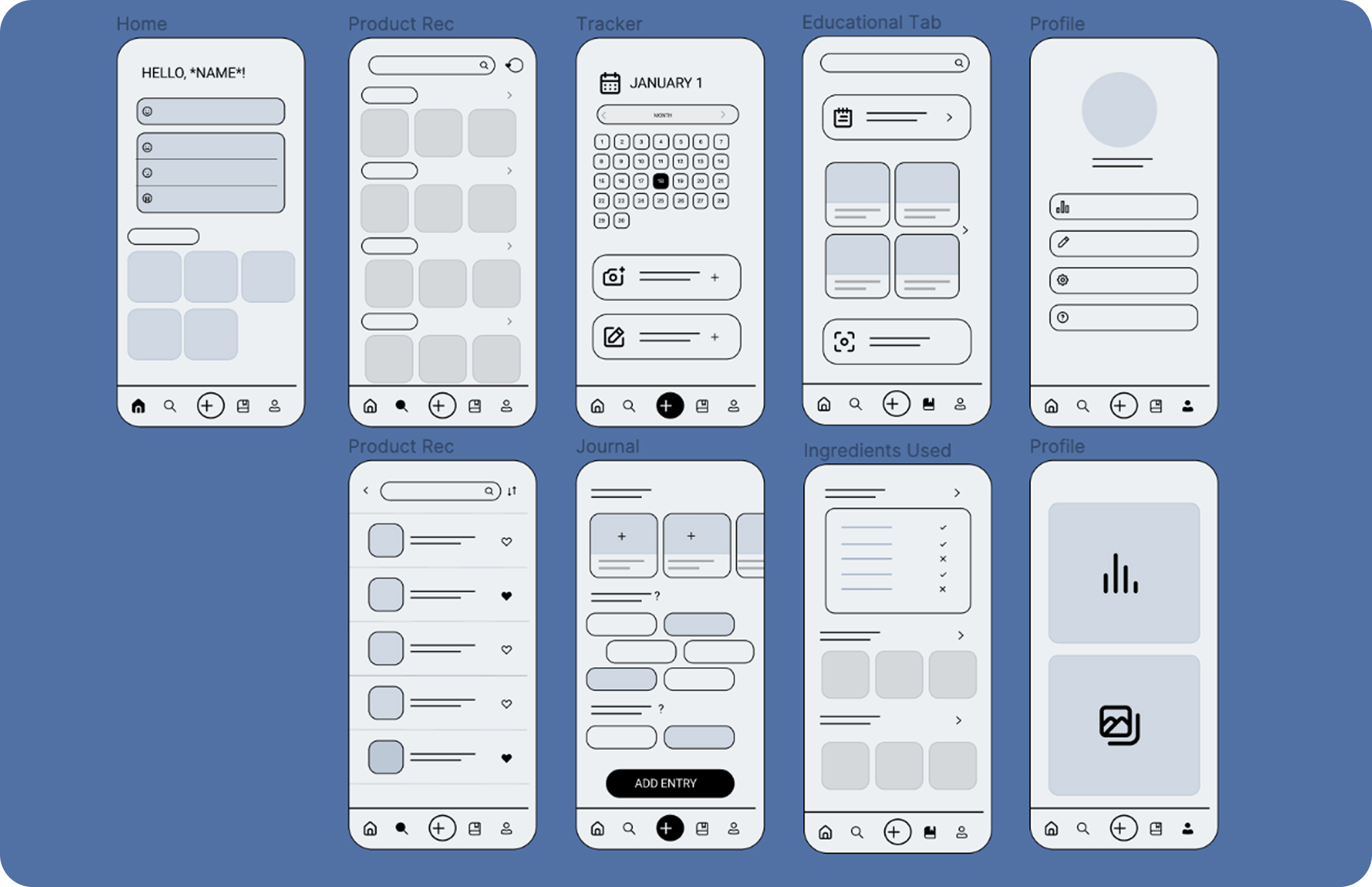
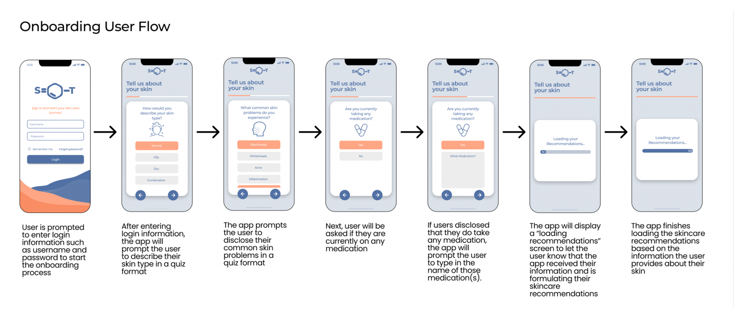
Simplified User's Skincare Journey from Education to Tracking
In my first UI/UX project with Design@UCI, we built SkinTrack—a platform for logging skin progress, tracking ingredients, and delivering bite‑sized skincare lessons so users can cut through information overload and personalize their routine.
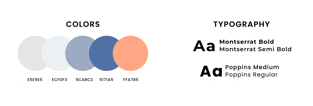
SKILLS
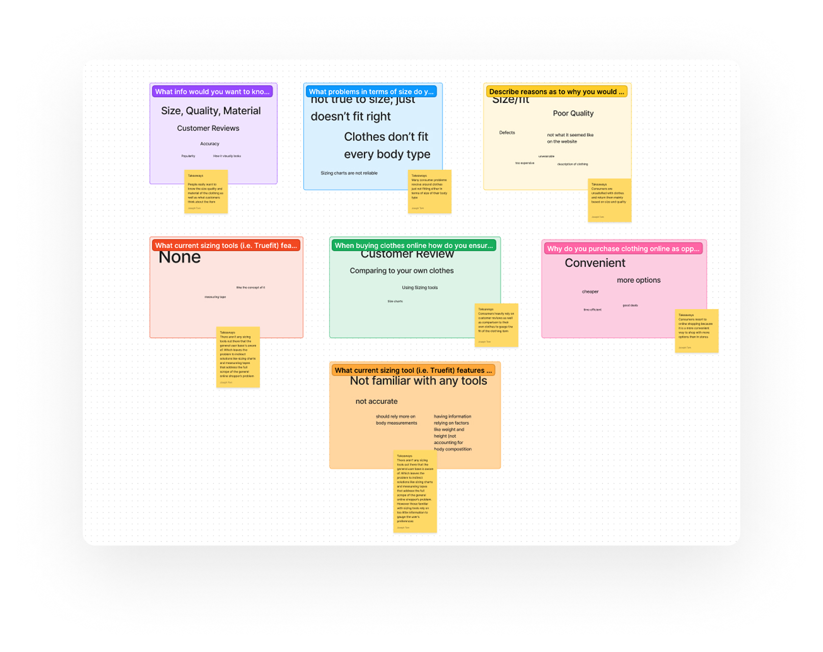
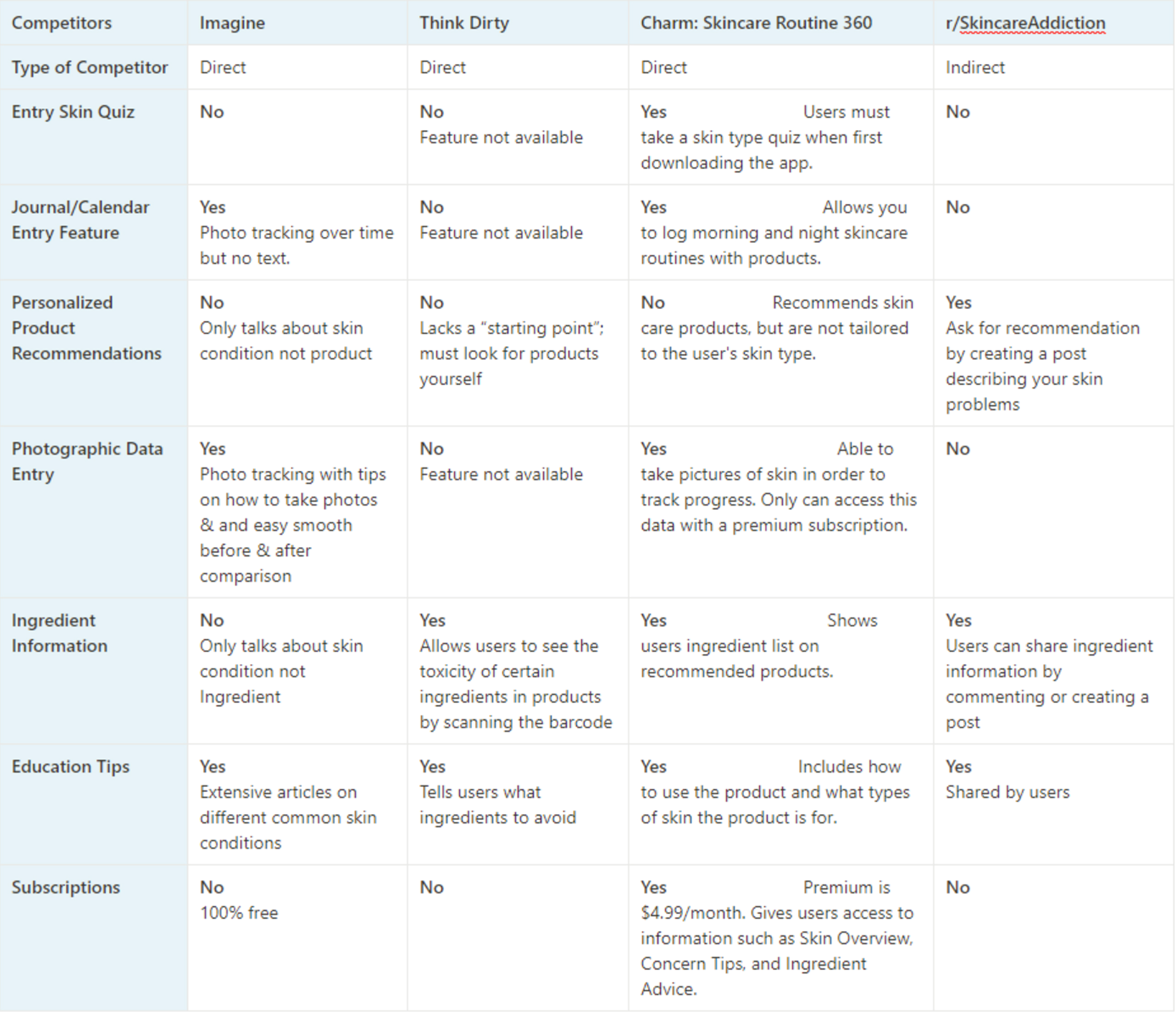
User Research
Design Systems
Visual Design
TOOLS
Figma
Notion
FigJam
Adobe CC