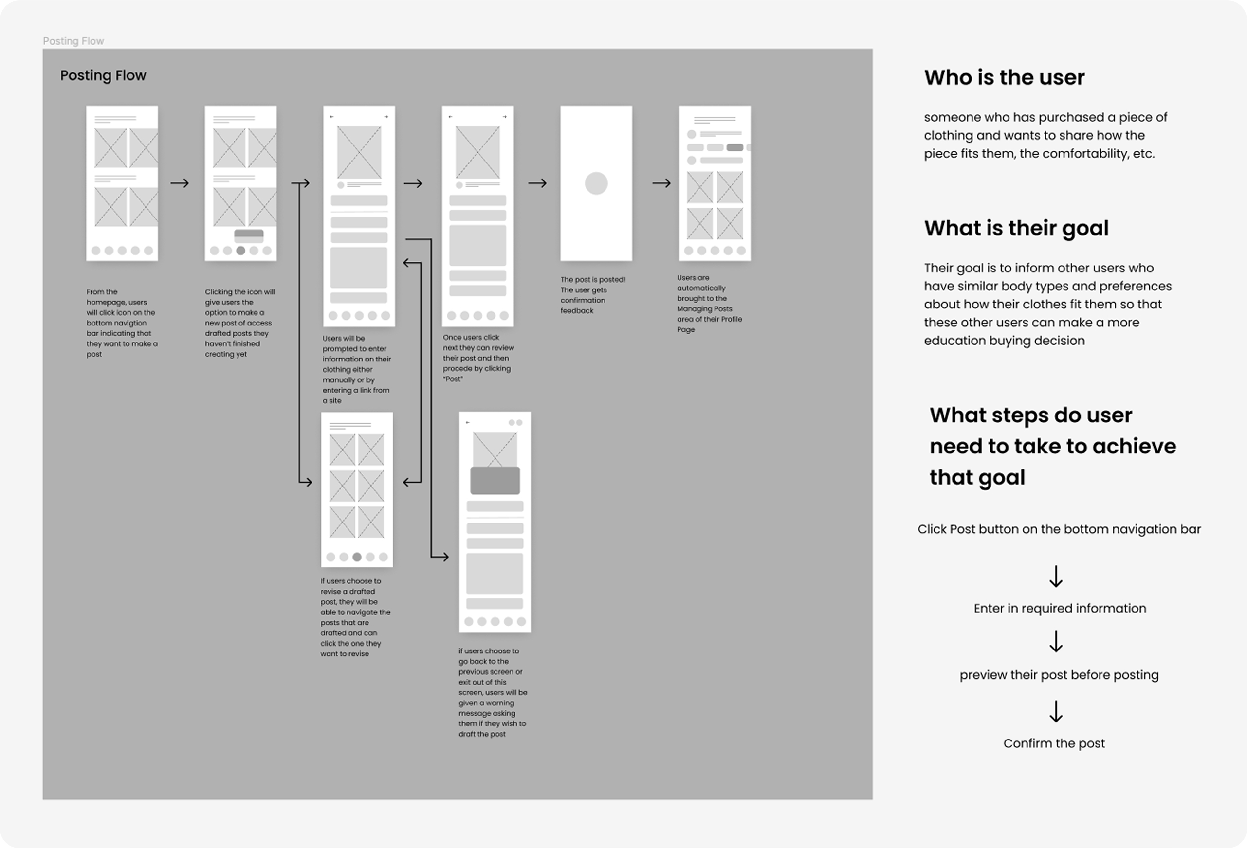
I facilitated the entire design process from ideation and user research to wireframing and prototyping. As a Product Design Extern for Meta, I worked alongside a Meta mentor to execute this passion project.
ROLE
UI/UX Designer
DURATION
July - Oct 2022
INDUSTRY
Retail E-Commerce
SKILLS
User Research Design Systems Interaction Design Visual Design
TOOLS
Figma Notion FigJam Adobe CC
Understanding the Problem
Shifting Behaviors in Retail has led to Dissatisfaction
Limited Access to Information
Customers cannot assess the sizing and quality of online purchases
Over-returning Clothes
The practice of bracketing is unsustainable to customers and the business
Reliance on Online Retail
The pandemic has forced shoppers to mainly rely on online retail
Increased Online Retail, Increased Returns
9% Increase in Online Retail
75% Increase in Online Clothing Returns
55% Shoppers note Size as the Reason for Returns
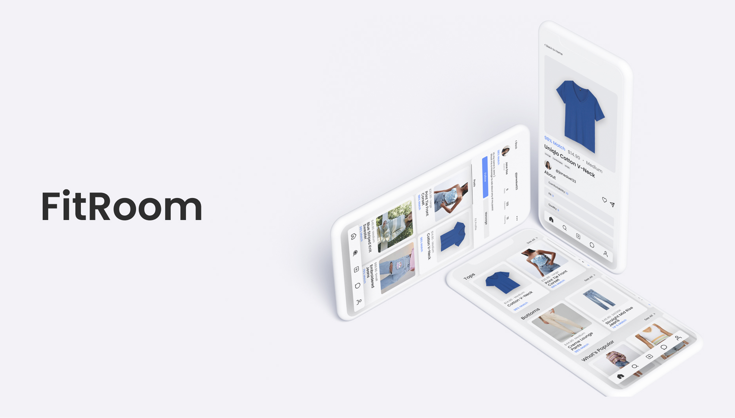
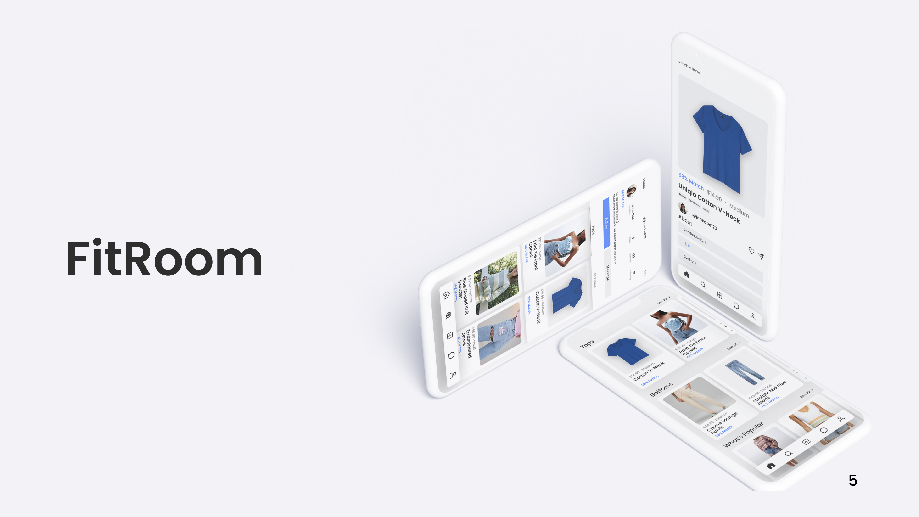
"How might we improve the online shopping experience so that shoppers feel more confident about the sizing and quality of their clothing purchases?"
The Solution
Understanding the User
Narrowing Down Target Audience
Ages 18-24, with diverse clothing styles, and use online shopping as their main source of getting clothes
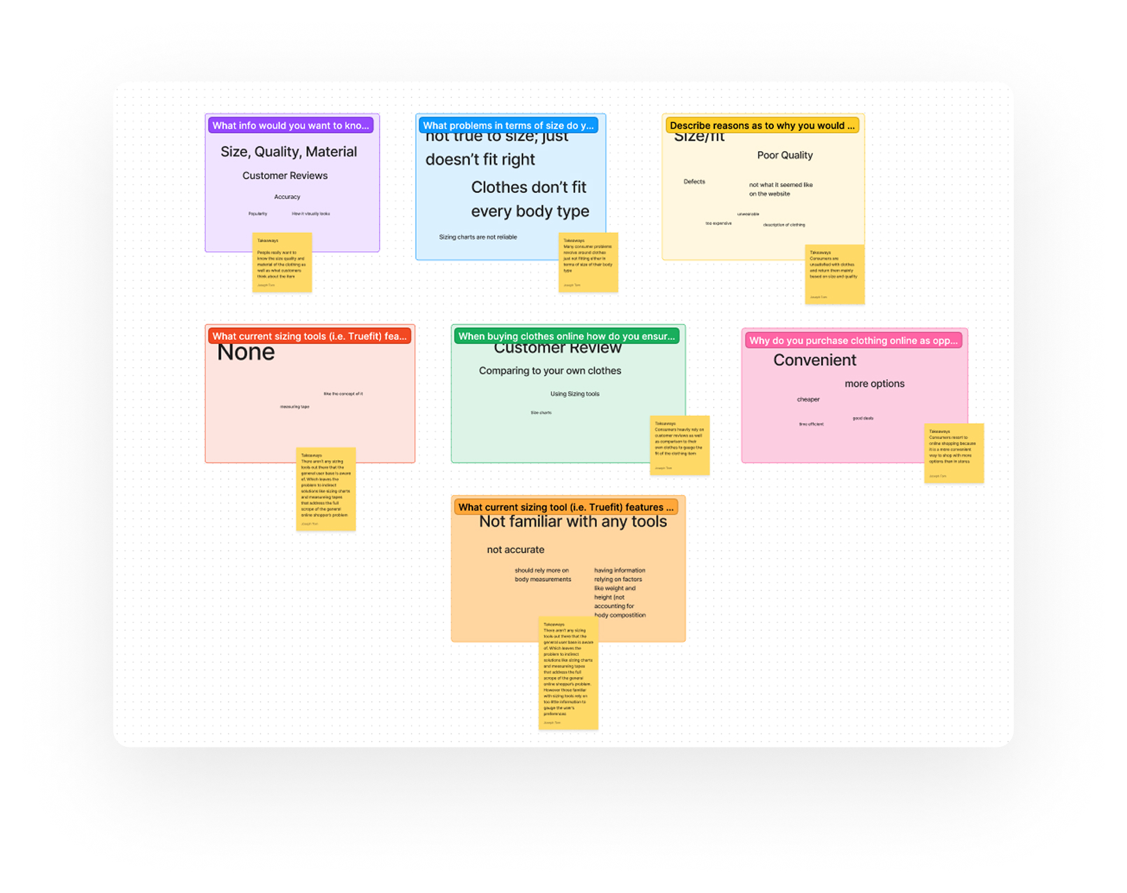
User Research (Surveys & Interviews)
Survey Research Objectives
1. Online shopping experiences and habits
2. What makes users more confident when purchasing clothes
3. Reasons why they are unsatisfied with their buying decisions
4. Criteria they abide by when choosing to make a purchase
Interview Research Objectives
1. How their general lifestyles influence their online shopping experience
2. A walk-through of their current methods for online shopping
3. What an ideal product would look like for them
Key Findings
Size,quality, and material are important
Current sizing tools rely on too little information
More interaction between customers is needed
Unawareness of currently existing sizing tools
Designing
Experimenting with Various Flows
Design System
Typography
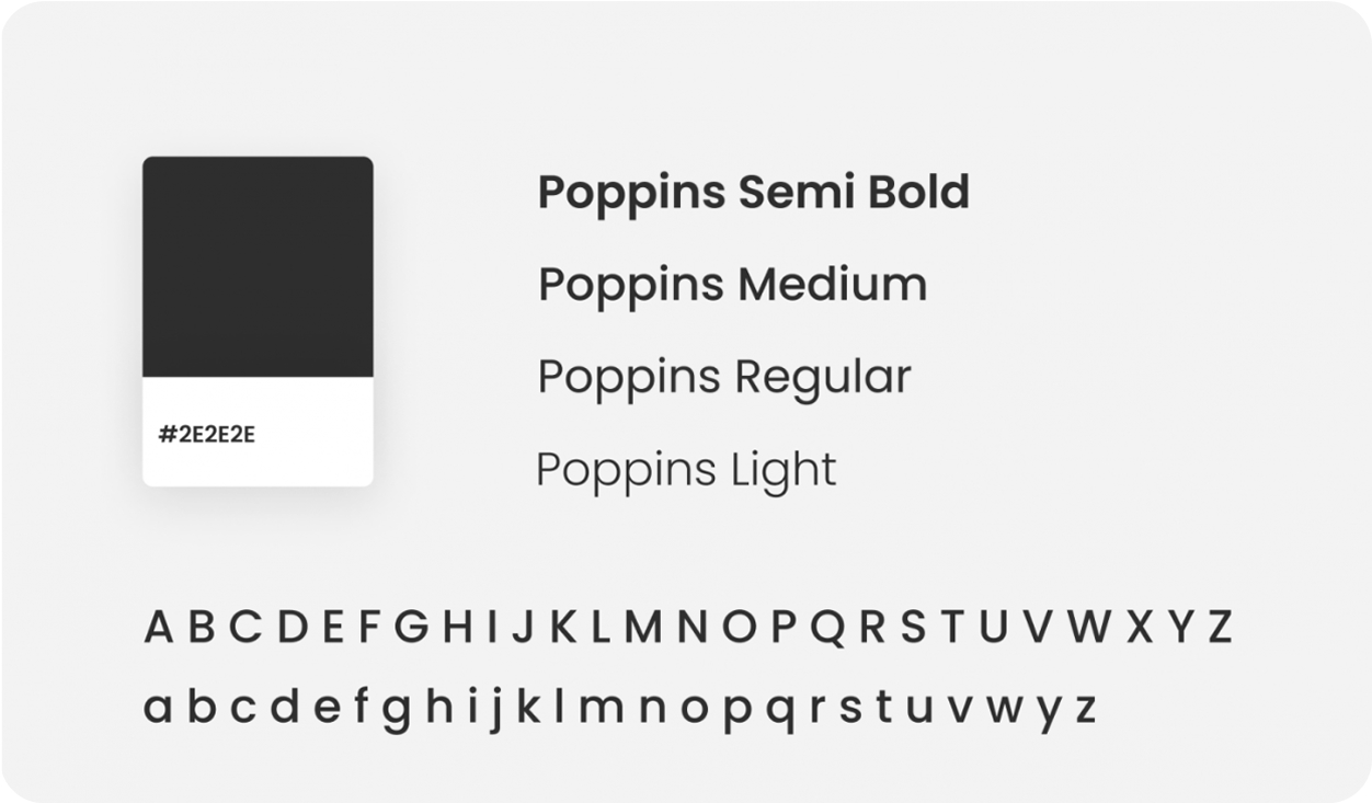
Poppins was an ideal typeface to use because its san serif typeface, which is modern and easy to read, aligning with my user base that is accustomed to modernism.
For text, instead of pure black (#000000), I decided to assign #2e2e2e as the text color to lessen the harsh contrast and subconsciously give my users a less strenuous visual experience
Color Scheme
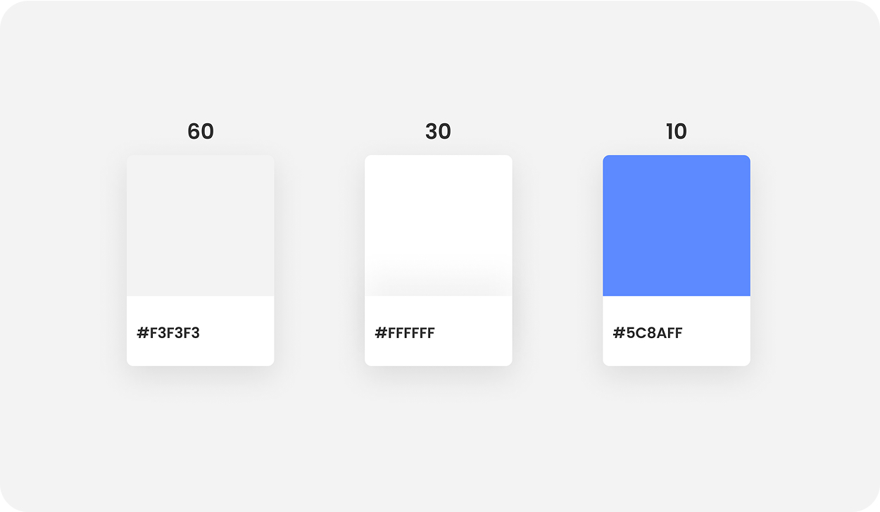
For the color scheme of the product, I wanted to incorporate the 60-30-10 rule to create a minimal, easy-to-navigate experience for my users.
Incorporating blue as my accent color helps the product signal confidence and trustworthiness.
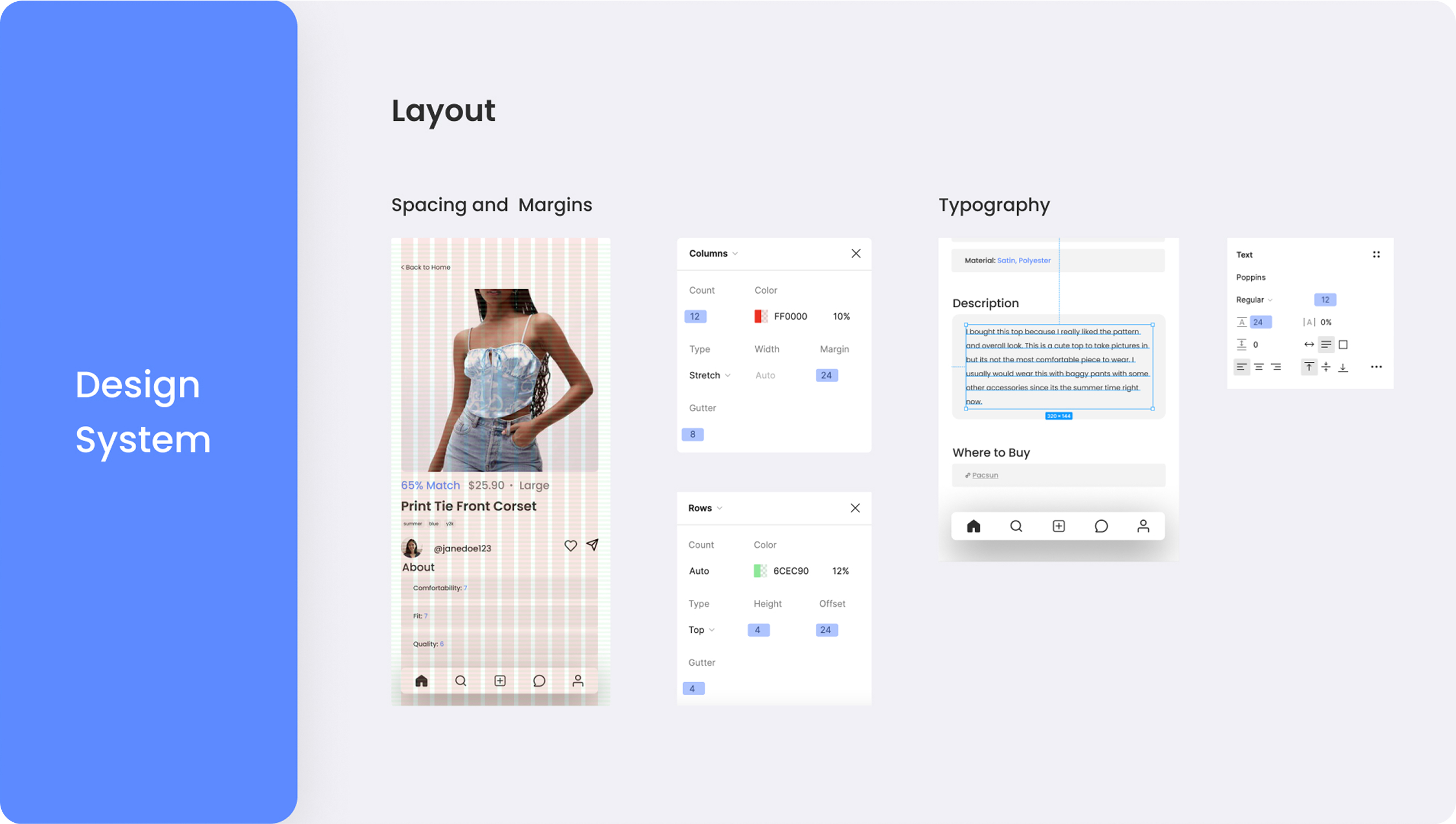
Layout
Spacing and Margins
I used font sizes in multiples of 4 to create consistency and establish a clear hierarchy throughout my screens
Typography
For spacing, I incorporated a layout grid with a baseline grid height of 4px so I could use easily scalable line heights with text-heavy UI elements. Margins were set at 24 px to be consistent with the baseline gridding.
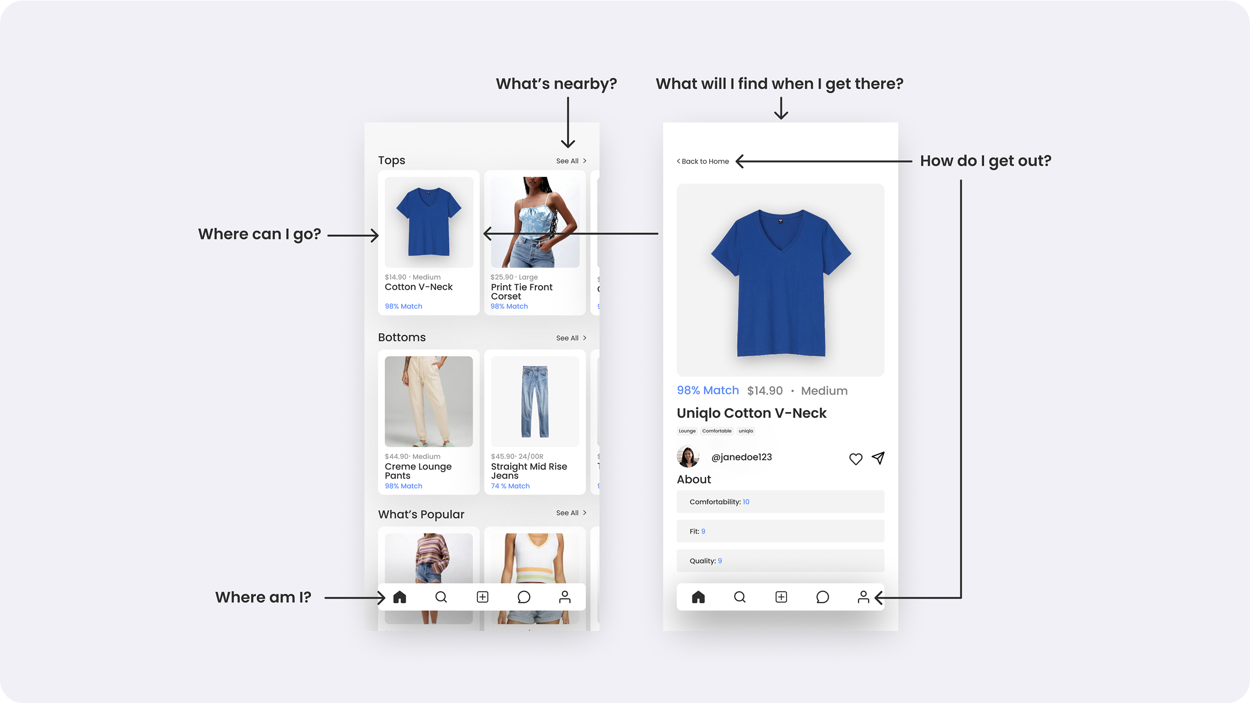
Design Principles: Wayfinding System
What is the Wayfinding System?
I designed with Apple's Wayfinding System discussed at the Worldwide Developers Conference since I was designing for primarily Apple users. To adhere to the Wayfinding System principle, I made sure that all my designs helped users answer these five questions:
We conducted Guided Usability Interviews...
Difficulty Navigating Information when Viewing Items
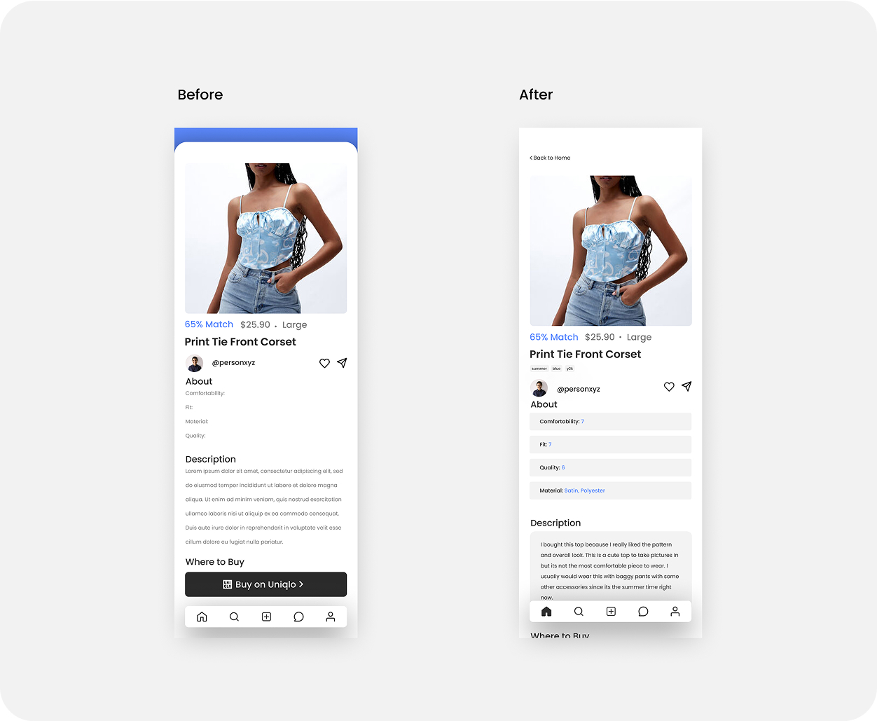
User testing revealed confusion on item pages due to "floating" elements. I refined the wireframes, tightening visual hierarchy, enforcing the design system, and compartmentalizing information.
Ambiguity on Information Comprehension on Item Photo Cards
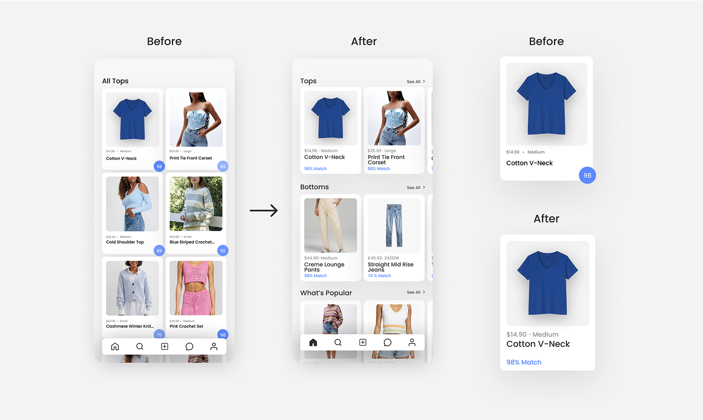
Users struggled to read the primary card component, so I increased text size and converted the match score to plain text for quicker comprehension.
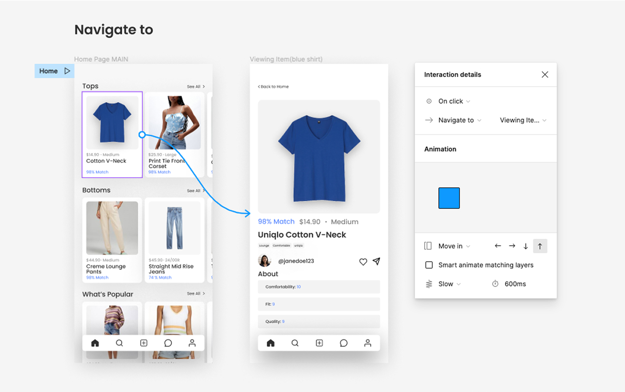
Screen Overlays Ruined the User Experience
Overlay‑based flows made back‑navigation unclear and prototyping clumsy. Replacing overlays with standalone screens simplified both user navigation and build efficiency.
Testimonials/Passion Project Takeaways
Testimonials from Users
"I base my decisions a lot on whether someone similar to me likes certain clothes, so I like how this app acts as a convenient place to gather those opinions."
"I would be way more confident shopping online for clothes using this app!"
Measuring Impact
As a solo project I couldn’t track impact directly, but I’d measure success through return rates, checkout conversions, and post‑purchase satisfaction.
Time Management
Lacking external deadlines, I would time‑box each design phase to maintain momentum and balanced focus.
Learning Before Doing
I usually learn by doing, yet stepping back to compare established prototyping patterns first would have led to sharper flow choices.